Classic Disaster or Classic Hit?
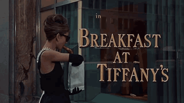
I wanted to add a different Rom-Com to my hate-watch journal and the movie Breakfast At Tiffany’s came across from some of my readers. Now I usually go all in and sit down and just watch the movie outright, but today I had a change of heart and decided to give the trailer a go first. Boy was that a mistake, but I honestly am glad I did it because I might have just spared about half of your eyes from this movie trailer. Now I can’t say I HATED every aspect of this trailer but I do have some lasting impressions I must discuss with y’all so let’s do a deep dive on this semi-horrendous trailer.

This wouldn’t be a proper post on my blog if I didn’t start with the negative first of course. One of my BIGGEST problems I had with this trailer was the lack of color creativity. Now I know that this was made in the 60s and it was a different time period blah blah blah. But let me get one thing straight, the color choice was not only super basic, but it did not match the theme of the trailer let alone the movie. You might ask “why were the colors basic” or “for the time period it was pretty innovative” and unfortunately I am going to burst your bubble because it did not help this trailer's case AT ALL. As I was watching all of the scene breaks to credit an actor, add text, or credit the director all that was going through my brain was BORING. I like to use the example of primary colors. They are basic, boring, and unoriginal. In the 60s this color pallet that was used was so common in EVERY. SINGLE. MOVIE. It gives no creativity and does not fit the vibes of what the characters are wearing in the trailer and doesn’t even match the aesthetic of the movie highlights they input in this trailer. This does not work for the trailer because it is so underwhelming when you watch the scene breaks and it makes the watcher kind of annoyed because you are breaking up the aesthetics of this movie that is supposed to portray classiness. While the movie might be a good one, I personally do not know as I have not added it to my hate-watch list, there is no doubt in the fact that the trailer does not portray classic movie status with the bright and ‘basic’ colors that is featured in this time period. Due to this it really does hurt the trailer rather than help it as many watchers, as myself, had a certain expectation of what the colors should look like.
Elaborating more on the topic of the movie scenes aesthetic with the horrendous color choice of scene breaks. This trailer did such a bad job with the color aesthetics in a way that really disappoints fans. Whenever I think of this movie my brain IMMEDIATELY goes to the actual store Tiffany’s. And whenever I think of the store I, as everyone else, thinks of the little blue box, white ribbons, and the glitz and glam. And to my great disappointment this trailer did not portray the glitz and glam of Tiffany’s at all. This did not bode well for the trailer as Holly is a very glitz and glam kind of girl and you can tell that by the first few seconds of the trailer from her sleep mask, dresses, and hats. As I was watching some of these scenes they chose I saw a glimpse of the assumed aesthetic of Holly and her imaginary lifestyle, but as soon as it switched to a scene break it completely ruined the moment. This does not go well for the trailer because there are such high expectations with a movie especially attached to a big glamorous store. And if you do take the leap to watch this trailer you become confused about this misstep with the use of terrible color choice.
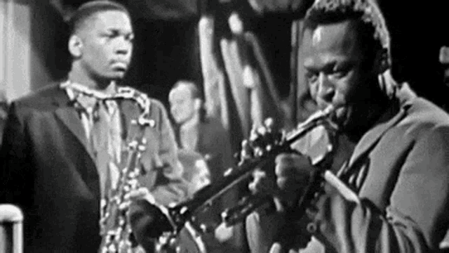
Now that I am unfortunately done hating this movie trailer, I would like to point out some things I really thought possibly saved it. The music choice was not only exquisite, but it really fixed the whole aesthetic of this trailer. Throughout all of the trailer they are playing a popular jazz tune that really transports you back into the 60s and you feel as if you are there with Holly and Paul during the whole trailer. I think this really works for the trailer because whenever you think of the 60s your brain immediately goes to some type of lyricless jazz song and not to mention this was a super popular music choice as well. Unlike the color choice you HAVE to choose a popular music choice or your trailer is immediately going to flop. This works well for the trailer because it compliments the aesthetic of the movie and it enhances the scenes they chose to highlight in the trailer giving it that light-hearted feeling they were trying to go for.
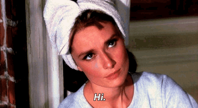
Half way through the trailer they switched to a sadder song choice Moon River. Not only is this the most popular song that is remembered by this movie, but it gives this trailer more of an edge than people realize or expected. Throughout the trailer you watch happy moments between Holly and Paul and then there is a switch to what I only assume is a drastic change in the movie and brings a sadder feeling to the trailer. I think this works super well in this trailer because this song hints that maybe Holly is not the happy go lucky romantic that she is portrayed in the beginning of the trailer and you see a softer more insecure side to her character. It also hints at both Paul and Holly’s character development and makes you excited to see what makes her sing the song or Paul write his book. These little pieces really strengthen the trailer to make the point that not everything is sunshine and rainbows in Holly’s life and she is trying to find herself.
Unfortunately, I cannot completely hate this trailer as it does have some really good features that made this trailer, EVEN THO I personally cannot stand the color choice the music makes up for this successful trailer!
Comments
Post a Comment